Manu-Services
Votre partenaire en capital humain et services externalisés au Sénégal et en Afrique de l’Ouest.
Intérim – CDD – CDI – Outsourcing RH – Paie & Conformité – EOR – Formation – Supervision/HSE.
Qui Sommes Nous ?
L’alliance du capital humain et du savoir-faire industriel.
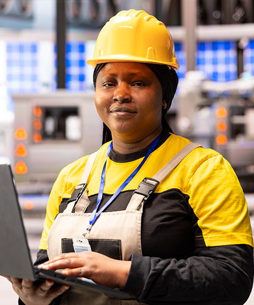
Avec plus de 20 ans d’expérience et 250 collaborateurs, Manu-Services SA soutient des leaders industriels comme Sococim, Codex SA.
Manu Services met à disposition des équipes qualifiées et prend en charge vos opérations RH (recrutement, contrats, paie, conformité, reporting), pour que vous vous concentriez sur l’essentiel.

Mission
Manu Services met à disposition des équipes qualifiées et prend en charge vos opérations RH (recrutement, contrats, paie, conformité, reporting), pour que vous vous concentriez sur l’essentiel.
Vision
Être la référence en Afrique de l’Ouest dans la gestion externalisée de personnel, en bâtissant un pont entre les meilleurs talents locaux et les projets ambitieux.
Valeurs
Intégrité
Réactivité
Excellence opérationnelle
Développement local
HSE
Manu Services en chiffres
Notre Méthode
1
Cadre & Profil
besoin, critères, délais, HSE.
2
Sourcing & Sélection
tests, entretiens, vérifs (références, habilitations
3
Validation Client
shortlist + entretiens finaux.
4
Déploiement & Intégration
briefing HSE, livrables d’entrée, point J+7.
5
Suivi & KPI
présence, productivité, sécurité, remplacement garanti.
Nos offres RH
Intérim / Mise à disposition temporaire
Des effectifs disponibles immédiatement pour vos pics d’activité, remplacements ou arrêts programmés.
Recrutement
CDD / CDI
De la chasse à l’intégration, nous sélectionnons vos futurs collaborateurs selon vos besoins opérationnels.
Outsourcing RH
Gestion de paie
Externalisez la gestion de vos ressources : contrats, paie, déclarations sociales et conformité réglementaire.
EOR
(Employer of Record)
Vous dirigez les activités, nous gérons toute la responsabilité légale et fiscale liée à l’emploi local.
Mobilité &
Rotation
Organisation complète des déplacements, hébergements et rotations de vos équipes sur le terrain.
Formation &
Habilitations
Sessions sur la sécurité, les métiers techniques et le développement des compétences.
Supervision &
Reporting
Encadrement sur site, suivi des KPI et remplacement rapide en cas d’absence.
Nos domaines d’intervention
Des solutions adaptées aux exigences industrielles
Industrie & Manufacturing
Mines, Énergie & Oil&Gas
BTP & Génie civil
Logistique & Transport
Tertiaire / Administratif
IT & Télécoms
Catalogue de profils
Technicien de maintenance
Magasinier / Opérateur logistique
Chef d’équipe
Agent administratif
Agent HSE / Agent d’entretien industriel

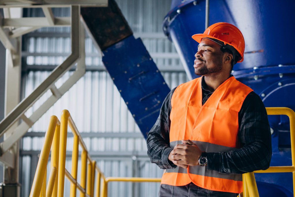
Politique HSE
La sécurité et le développement durable au cœur de nos actions
Un savoir-faire éprouvé sur le terrain, forgé par des années d’expérience au contact direct des réalités industrielles, pour garantir des interventions efficaces, sécurisées et adaptées à chaque environnement.
- Port obligatoire des EPI
- Formations régulières
- Suivi médical du personnel
- Objectif zéro accident
- Gestion responsable des déchets
Différenciateurs
Pourquoi
Manuservices
Un savoir-faire éprouvé sur le terrain, forgé par des années d’expérience au contact direct des réalités industrielles, pour garantir des interventions efficaces, sécurisées et adaptées à chaque environnement.
- Double ADN : agence RH et savoir-faire industriel.
- Réactivité & maillage local : vivier qualifié, délai court.
- Conformité & Paie : vous externalisez les risques sociaux/fiscaux.
- HSE : zéro compromis, formation continue, audits.
- Transparence : SLA/KPI contractualisés, reporting mensuel.


Vous êtes une entreprise ?
Manu-Services SA sélectionne et met à disposition des profils qualifiés selon vos exigences.
Notre équipe RH, appuyée sur un vivier local et un fort engagement HSE, vous répond sous 24h.
Vous êtes un candidat ?
Rejoignez le Talent Pool Manu-Services et accédez en priorité aux missions correspondant à vos compétences.
Nous valorisons nos collaborateurs par la formation, la sécurité et la stabilité professionnelle.